As you browse your favorite websites, take a moment and look past the content but the actual design of the site itself. Notice anything? You might miss it at first but you’ll soon notice a lot of the same design elements across your favorite websites. It has become common practice to place certain elements in specific locations for the ultimate goal of achieving more conversions, whether it’s a lead or sale from the current traffic you get. Here’s 7 simple tips to help you optimize your website for conversions.
Notification Strip
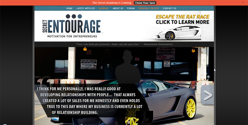
Look at the very top of this page and what do you see? One of the easiest ways to draw attention to a specific product or page is through a notification bar that resides at the very top of a page. This is used for more of an ‘announcement’ but can also be great to capture email sign up leads or just bring general awareness to something while not being so intrusive. The most popular tool to achieve that is through HelloBar which is free to try. It also allows you to split test different bar variations to determine the best performer which is based on clicks.
Sidebar Ad
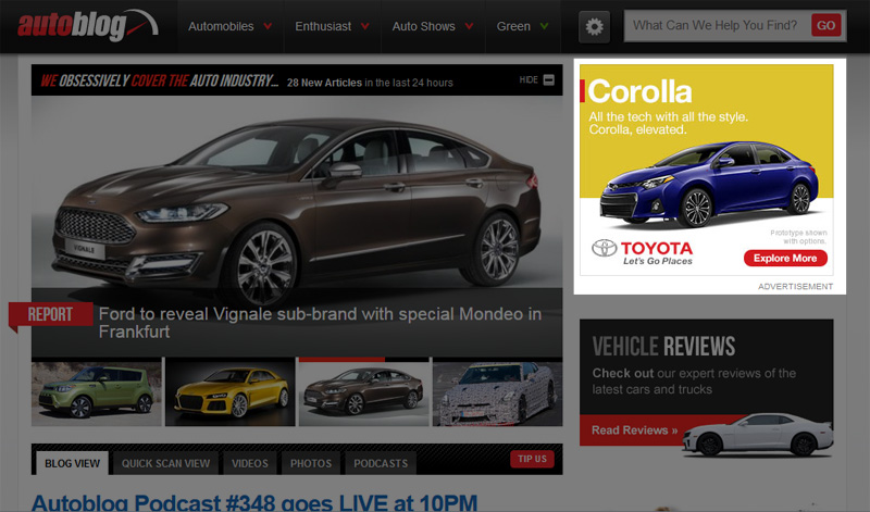
A lot of blogs utilize a two column design where the left column holds most of the bulk content and the right column is a sidebar filled with advertisements and miscellaneous items like links. A prime spot for advertisements is always at the very top. Why? Because this location is usually ‘above the fold’ meaning the user will see your ad before they even need to scroll down. It is one of the most widely used ad placements out there and even has a common standardized size of 300×250. Instead of running an ad, we have an email sign up form. As you can see below Autoblog, the very popular car blog, uses that ad placement and probably charges big bucks ;)
Floating Sidebar Ad
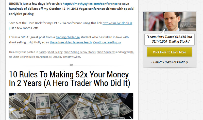
But what happens if a user scrolls down as they read your content? No fear as you can implement what’s called a sticky or floating ad that stays with you as you scroll down. This is great because your ad will constantly be in front of the user but it will also stand out as it might be the only thing on the sidebar as they scroll down. We leverage this strategy to drive traffic to Third Circle Theory as you scroll down this page but you can also mimic this strategy by installing a plugin like Sticky Widget for WordPress. Our pal Tim Sykes leverages this on his blog as you can see below. Also note that it’s important to put words like “click here” to let the user know its clickable.
In Between Posts
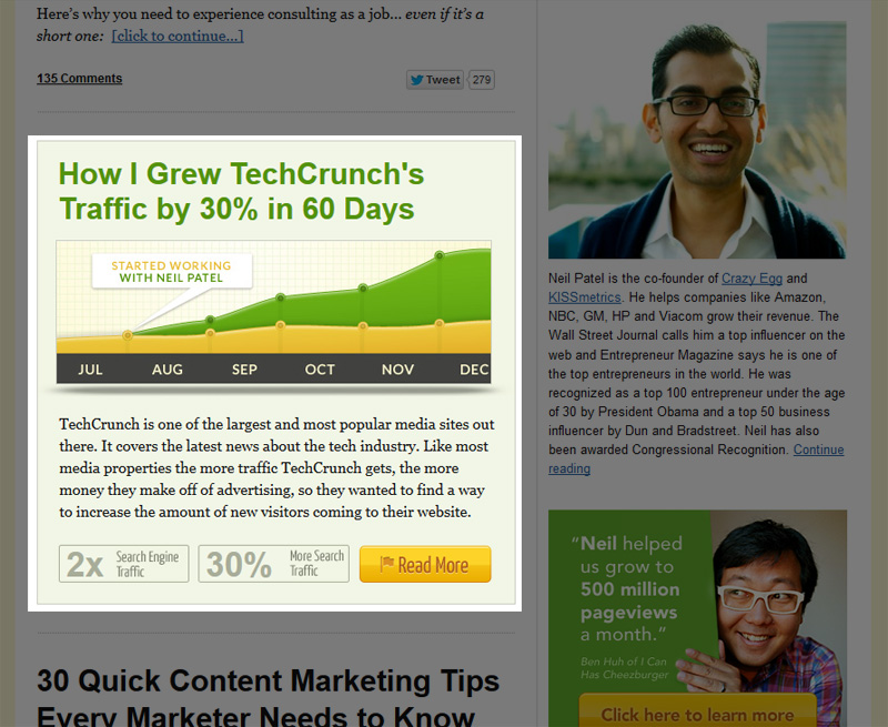
Since the blog format has become a standardized publishing format, it’s normal to see post after post of the latest articles on any given website. As a user is looking through your archives, it’s important to try to capitalize at that moment since you have their undivided attention as they are wanting to read more. One quick tip to do that is to put an ad in between your latest posts. It’s not as simple as installing a plugin (as far as we know) but it can be done with a simple code insertion on your website. Our buddy Neil Patel leverages this strategy after his first post and second to last on his website.
After The Post
Perhaps even more important is what the user sees after they read your post. If you think about it, a very large portion of your website traffic will NOT go to your homepage but rather your sub pages. This is the basic philosophy of ‘long tail seo’ where you try to generate traffic by going after low competition but moderately searched keywords. So because of this, you will most like drive traffic to a page/post on your website. What happens after a user finishes reading your awesome post is very important as that is your moment to hook them in. Obviously every website will have a different purpose and therefore dictate the call to action but if you’re reviewing a product then it’d make sense to push the user to try to purchase. On the other hand, if you just want to grow your brand then it doesn’t hurt to simply add way for someone to subscribe. Our upcoming success story Pat Flynn uses this strategy and has grew his reader base to over 150,000. You don’t need any fancy tools since most email providers provide some sort of design and code but Pat uses Optin Skin which is one of many available scripts.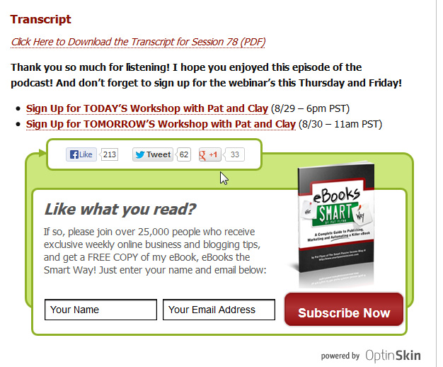
The Popup
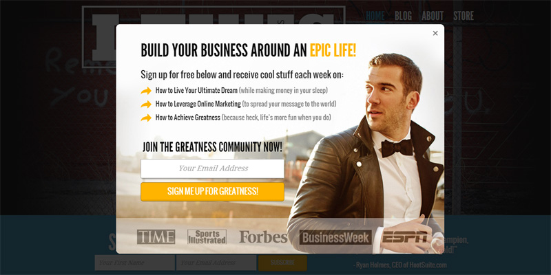
Popups are annoying and most of us hate them but its hard to discredit them because they work so well. Not all popups are intrusive though since they popup within the website itself rather than a new tab or window. As with everything we’re talking about, the purpose for a popup is many but is often time used to capture email sign ups. Why are email sign ups important? Because people are subscribing to something that interests them and is another channel of communication and direct response marketing. For a popup to work, it must look beautiful and that is why we and many other marketers use Popup Domination, which creates stunning popups for email capturing. Our boy Lewis Howes builds his audience through a variety of ways but turns all that traffic into long term readers through his simple yet effective popup form.
The Exit Popup
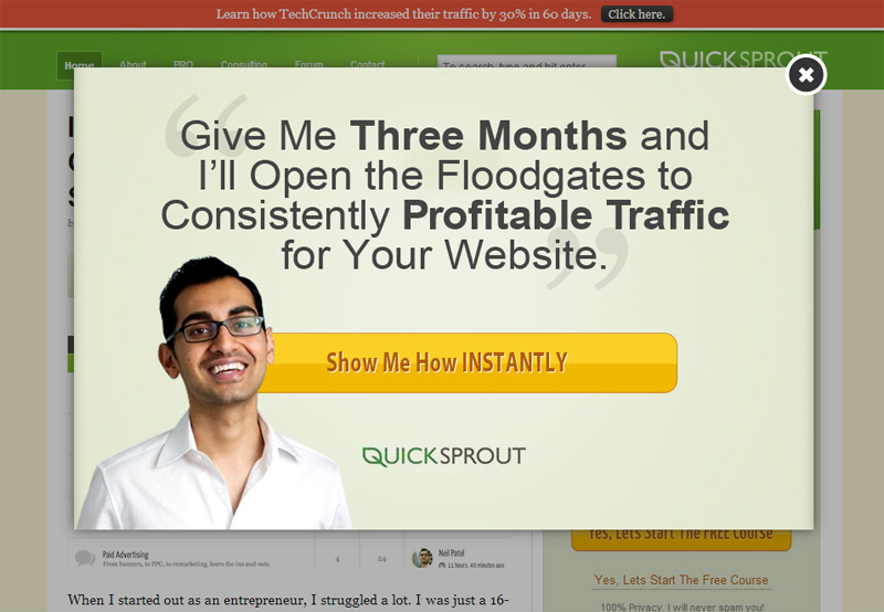
A strategy we don’t utilize but see often is the exit popup. This popup occurs when it detects a user that tries to close out of a window/tab of your website or even simply just mouses over the tab before they close out it. It’s a bit aggressive for some but is nothing more than a last effort to try to capture that visitor once more before they leave for good. There’s a ton of scripts and plugins available if you Google it but a common one is Bounce Exchange. To see it in action you can go to Neil Patels blog and try to close out of it.
There are your quick and dirty tips to optimize your website to convert more of your existing traffic to sales and leads. We leverage many of these strategies as we’ve learned from the best. Can you spot them all?
